I’ve seen numerous people advocate the use of Range Bars for Gantt charts in SSRS. Well, yes, of the natively supplied widgets, it does best fit the bill. But it’s not great.
It’s probably fine for some types of Gantt, but it doesn’t work if you want to show resources mapped to a calendar grid. MS Project, at least at one time, called this activity Team Planning , but you might want to do it for additional resources such as room or equipment use. Here’s an example, from https://www.mpug.com/articles/the-best-resource-workload-views-in-microsoft-project-2010/:
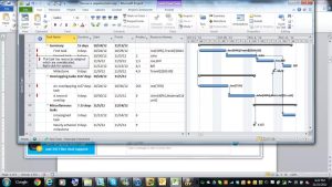
The problem is getting the bars that belong to one resource horizontally on the same line. Yes, I know you can use the Range Bar Custom Attribute DrawSideBySide to this for some extent — but that only works if the two tasks are contiguous. It doesn’t seem to work where you have a task, and then some empty space representing an unallocated period of time, followed by another task.
SQL to the Rescue
It turns out you can do this with a garden variety matrix in SSRS, with a little more work on the query side. I’ve now done this particular trick in a bunch of different contexts, with variations, and it works a treat.
As usual, you have some choices you can make about where you want to put the complexity: do you want to code more in the query? Or more in the RDL design code? In this walkthrough, I’m going to put all the complexity on the SQL side; in fact, I’ll use the Report Wizard for dashing the matrix together at the end, and just adjust a couple of default attributes on objects in the RDL afterwards. There’s hardly an IIF() expression in site. But once you see the trick to it, you can adjust the balance of coding and do more in the Designer, if you prefer.
Limitations?
The only one I can think of is this: there is a width minimum for a column in an RDL matrix, so you’ll find — even if you minimize padding and borders — you can’t use this trick if your durations are in the minute or second range, because 60 * the column width and you go off into hyperspace on the right pretty quickly. I found this out trying to capture some sub-minute device readings for Poseidon — in the end, we’ve settled for not having the proper horizontal orientation rather than have very, very wide reports.
n this walkthrough I’ll use a half-hour as the lowest level duration that we can display, and that seems to work fine.
Setup
I’ve gotten a little tired of using the Sql World database for examples lately, and besides it doesn’t have interesting datetimes, so I’ve finally succumbed to Brent Ozar‘s blandishments and downloaded a small subset of the Stack Overflow data dump — I used the dba subset, natch. I used the SODDI importer tool to load it, which worked fine.
You’ll need to add a Date Dimension table of some sort to this, if you don’t already have one. Everybody has their favorite way of doing this; I used this one because I always find its holiday and other extra data is handy, especially for Dominican work.
What we’re going to do, with this data, is look at the Posts or threads available for various Locations as provided by users when they login to add content. We’ll treat the original poster’s Location as a Resource, the date the Post was created as the Start of the thread, and the max of the Comments in this thread during the current query period as the End of the thread. This is fairly contrived, but grouping people together by Location gives us a reasonable number of “resources” and a critical mass of data per-resource.
User parameters you’ll probably want to add
I’ve included some parameter values directly in the query as variables — for your purposes, these are the ones that I thought would be useful to expose in a real report:
-- parameters
DECLARE @HoursBottom AS TINYINT = 8;
DECLARE @HoursTop AS TINYINT = 18;
DECLARE @DateBottom AS DATE = '1/10/2017';
DECLARE @DateTop AS DATE = '1/13/2017';
DECLARE @maxColors AS TINYINT = 7;
DECLARE @minItems AS TINYINT = 2;
DECLARE @nullReplacement as VARCHAR(3) = 'Unknown' ;
---- end parameters
- time period of interest (bottom and top hours). These are expressed as hours, from 0 to 24, and would normally be a dropdown type parameter if you wanted to highlight a significant slice of the day, rather than all 24 hours.
Note that, while StackOverflow obviously operates 24×7, in my example parameter values,
I’ve chosen a reasonably busy slice of its hours across all Locations,
to show sufficient contrasting activity in the “graph”. (All times are stored in UTC.)
- bottom and top dates. There’s almost always a time period you want to use.
- maxColors. while there may be many resources displayed, this represents the set of colors you’d like to cycle through. In my example, there is a set of 7 colors in a CTE, so the 8th row on the “graph” is going to start with the first color again, and this number is known. But you might want to expose this to users, or derive it in code, if you’re data-driving your colors, or generating the values.
- minItems. There are so many Locations registered by users on StackOverflow, I chose not to display Locations that have less than 2 Posts in my chosen time period. You might want to show all activity for your resources, and this number would be 0 for you.
- null resource ID replacement. This may not be useful for you either, but if it’s possible for you to have (say) unassigned tasks, and if you want to include them on the “graph”, you need to provide a value representing the “null resource ID” for your grouped rows. In my example, many, many people don’t provide their Locations at all, and since this is the most numerous set by far, I didn’t want to leave it out of the picture. If you need this, it’s likely a hidden parameter. See next item why you might want to declare it outside the query in a hidden parameter.
- not included above, but possibly useful: you may want to provide a multi-select dropdown of feasible resources, so that the user can pick which rows they want to see. In my case, the query supporting this multi-select parameter might look something like this (untested!):
SELECT isnull(Location,@nullReplacement) as Value,
isnull(Location,@nullReplacement) +
    ' (' + cast(count(*) as varchar(10)) + ') ' as Label
FROM Users u
JOIN Comments c  ON u.ID = c.UserId
WHERE c.CreationDate BETWEEN @DateBottom AND @DateTop
GROUP BY Location
HAVING COUNT(*) >= @minItems
ORDER BY COUNT(*) DESC ;
Let’s get started!
The first part of the query is a set of 3 CTEs that serves to identify a set of resource rows and assign sorting and colors to them.
Note that I’ve used CTEs at the beginning of this query, and switched to temp tables for the latter part of it. This is purely a matter of taste, in many cases, but here I’m using CTEs for some very inconsequential data and then switching over to temp tables for large datasets.
with resourceColors as (
select 0 as resourceColorNumber, 'PaleVioletRed' as resourceColor
union all
select 1, 'LightSalmon' as resourceColor
union all
select 2, 'Tan' as resourceColor
union all
select 3, 'DarkSeaGreen' as resourceColor
union all
select 4, 'LightSteelBlue' as resourceColor
union all
select 5, 'CornflowerBlue' as resourceColor
union all
select 6, 'Plum' as resourceColor ) ,
resources as (
select row_number() over (order by count(*) desc ) as resourceNumber,
isnull(Location, @nullReplacement) as resourceID
from Users u
join Posts p on u.id = p.OwnerUserId
join (
select comments.ID, PostID
from Comments
join Posts on Comments.PostId = Posts.ID
where Posts.CreationDate between @DateBottom and @DateTop ) c
on p.ID = c.PostId
where p.CreationDate between @DateBottom and @DateTop
group by isnull(Location, @nullReplacement)
having count(*) >= @minItems ) ,
resourceInfo as (
select resourceID, resourceColor, resourceNumber
from resources m
join resourceColors rc
on m.resourceNumber % @maxColors = rc.resourceColorNumber
)
The first CTE, resourceColors, just picks up the colors available for different rows in the “graph”. (Note: in some cases you might want to show these as a key on top against each resource, or against the resource names or IDs). As explained earlier, you might have many ways of doing this, but however you do it, you’re going to want to know what the number of available colors (@maxColors, in my example). Each color is assigned a consecutive number, starting with 0.
The second CTE, resources, picks up the list of resources we are going to display in rows. Each resource is assigned a unique sorting value — here, I’ve chosen to sort by the highest to lowest thread activity, but you might do it alphabetically, or however you like,
The third CTE, resourceInfo, puts this information together, assigning a resourceColor to each row based on its expected sorting according to its unique resourceNumber plus a modulus expression using resourceNumber and @maxColors. (That’s why we numbered the available colors starting with 0 in the first CTE.)
Get a set of appropriate events that fit your selected resources and datetimes
We’ll create a temp table that uses this information and gets data for the start and end times, as well as specified colors, for our resources, based on the final CTE:
select
r.resourceNumber,
r.resourceID,
resourceColor,
p.CreationDate as EventStart,
c.AnsweredDate as EventEnd,
p.Title
into #resourceEvents
from resourceInfo r
join Users u
on isnull(Location,@nullReplacement) = r.resourceID
join Posts p
on u.Id = p.OwnerUserId
join
(select
PostID,
max(comments.CreationDate) as AnsweredDate
from Comments
join Posts on Comments.PostId = Posts.ID
where Posts.CreationDate between @DateBottom and @DateTop group by PostID
) c
on p.ID = c.PostId
where p.CreationDate between @DateBottom and @DateTop;
… there’s probably a better way to get a relevant sample data set from StackOverflow data, but, hey, it’s my first time, and it will serve for this example.
Now to derive our calendar grid
Here’s where the DateDimension table comes in. Whether there was activity in it or not, we need a cell for each row for each possible time period. We create a temp table for this purpose, mostly because we happen to want half-hour increments and our DateDimension table stores only to-the-hour granularity:
-- we'll create a "half hour dimension":
select
DatePart(month,d.Date) as MonthNo,
DatePart(week,d.Date) as Week,
d.Date, DatePart(Day,d.Date) as Day,
d.IsWeekend, Hour,
cast(cast(Hour as varchar(2)) + ':' +
     case when BottomHalfHour = 0 then '00' else '30' end as DateTime)
     as StartTime,
cast(cast(Hour as varchar(2)) + ':' +
     case when BottomHalfHour = 0 then '29' else '59' end as DateTime)
     as EndTime,
case
when Hour = 0 and BottomHalfHour = 0 then 'mid nt'
when Hour = 12 and BottomHalfHour = 0 then 'noon'
else cast(case when Hour < 13 then Hour else Hour - 12
end as varchar(2)) +
case when BottomHalfHour = 0 then ':00' else ':30' end +
case when Hour < 12 then ' am' else ' pm' end end
as halfHourLabel
into #halfHours
from  dbo.DateDimension d join
( select top 24 Day-1 as Hour, 0 as BottomHalfHour from  dbo.DateDimension
union all
select top 24 Day-1 as Hour, 1 as BottomHalfHour from dbo.DateDimension ) h
on 1=1
where d.Date between @DateBottom and @DateTop
and h.Hour between @HoursBottom and @HoursTop
order by 1,2
… Notice that I include both a MonthName for display and a Month numeric value to ensure correct sorting. If your data may span more than one calendar year, you’ll want to include Year too, of course. I’ve also included a “Week” value, which you could use for both sorting and grouping as an interim level between Month and Day, should this suit your purposes, although I am not using it here.
Now put it together for the RDL dataset
… and of course, drop the temp tables for neatness’ sake:
select h.MonthNo,
-- add Week here too if you want
h.Date,
h.Day,
h.Hour,
h.StartTime,
h.halfHourLabel,
e.resourceID,
case when h.IsWeekend = 1 then 'Gainsboro' else 'WhiteSmoke' end as dayColor,
DateName(month,h.Date) as MonthName, isnull( e.Title, 'No Title') as Title,
isnull(e.resourceColor,'White') as resourceColor,
e.resourceNumber from #halfHours h
left join #resourceEvents e
on cast(eventStart as date) = h.date and
eventStart= cast(h.Date as DateTime)+ h.EndTime
order by 1,2,3,4,5,isnull(e.Title,'ZZZZZ');

drop table #halfHours ;
drop table #resourceEvents ;
… the final SELECT is really pretty simple, and has everything we’ll need based on the previous queries. The only thing it’s adding in is a dayColor value, for use in the headers, so that weekends are clearly distinguished from weekdays, and this is certainly not a critical requirement.
What’s really going on here? We’re talking our calendar data and creating a left join with our event data. So, some matrix cells will be empty (NULLs) because nothing is going on for a given resource for that time period.
Enough SQL? Ready to have some Designer fun?
OK, here you go.
 |
As promised, having dumped the query into the RDL, I can use the Report Wizard to group things the way we would expect for a calendar grid — it’s straightforward enough that it’s easier to show you what I grabbed in the Wizard than explain in words (fullsize if you click), but the jist is:
And now we have very little left to do. |
Stupid Designer pet tricks
Here’s all that’s left to do in the Designer to make this work:
- Set the row group to be ordered by resourceNumber, because by default it’s going to add a sort by the value you provided in the grouping. We want our specified sorting to reflect our expected cycling through color values.
- Similarly, the outermost column group needs to sort by MonthNo, not MonthName. For clarity, if you prefer, group on MonthNo too. I just tend to pick up on the display items when I’m working in the Wizard, which I do very rarely. The innermost column group, which will display our halfHourLabel, should sort by StartTime and, for clarity, it might as well group by StartTime too. Again, the halfHourLabel was for display purposes.
- Set the Fill (backcolor) of the Day and halfHour header cells to dayColor, remember we’ll just do this for fun to distinguish weekends from weekdays::
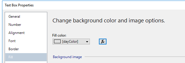
- and finally — this is the critical trick — change two properties of the matrix detail cells
- the Fill (backcolor) of the detail cells should be =Fields!resourceColor.Value, just like header cells’ Fill or backcolor you changed in the last step
- the Expression for the textbox in the detail cells should be blank (I use =space(0)).
That’s really it! This works natively — again, without any iif() to check to see if you have a resource event for a cell, although if you like you can complicate things by adding one — because the null cells don’t get any fill at all, they stay blank. In every version of SSRS I’ve tried.
A few more non-essentials
- If you want, for extra credit, you can gussy things up with a tooltip on the detail level, showing what’s really going on in that cell or cells. In my example data set, I used this expression in the tooltip, but it would be different in every case:
=iif(countDistinct(Fields!Title.Value) = 0,””,
First(Fields!resourceID.Value) & “: ” & First(Fields!Title.Value)) &
iif(countDistinct(Fields!Title.Value) > 1,
“… (” & countDistinct(Fields!Title.Value) & ” threads in this time pd)”,””) - Typically, in non-example datasets, there’s also a drilldown from the detail cell, that will show the resource task or event details pertinent to the day and resource row. I suppose I could have done that here by bringing up a set of post titles and answers/comments for each. You can see immediately that you have the information you need to parameterize the drilldown report with the data to hand in the current cell.
- The native collapse-expand behavior also lends itself to gussying up a report like this, again because it tends to be very wide, and starting off the months or days or weeks as collapsed allows the viewer to quickly zero in on areas of interest. I almost always use it in reports using this technique.
- While bare Day numbers are used in the column headers to facilitate “skinniness” of columns, depending on how you do your collapse-expand, a tooltip on, say, =FormatDateTime(Fields!Date.Value, DateFormat.LongDate) can be very informative here.
And that’s all she wrote… Wait.
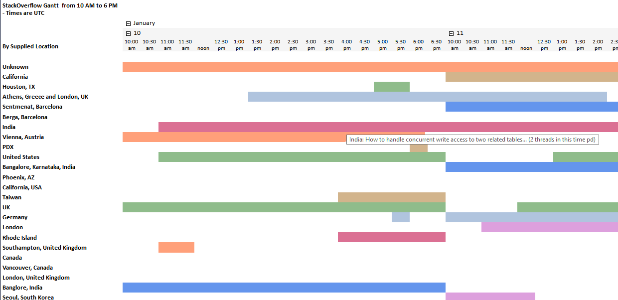
Wait. You want to see what it looks like? Oh, that’s right, eye candy was the whole point… so here you go:
… and here’s the RDL, not that it’s anything special, but it does contain all the SqL. Gantt.rdl (21.76 kb)
You’ll notice a “hard stop” at the beginning of the day; there are no horizontal bars that span this time. This is due to the @HoursBottom and @HoursTop values picking up a limited slice of the 24-hour period, and is not a limitation of the technique.
This simple technique has come in handy many times, and really it’s hardly anything from a reporting perspective. Have fun!
Hello,
what a nice solution.
Is the Report still available, the link seems to be broken.
Hi Konstantin,
The report is actually there — and it is in the same folder as all the images that are showing up in this post, just fine — but for some reason it (and it seems all other non-image-type files) that I uploaded to this non-default location don’t seem to be downloadable within WordPress. I’m sure it’s a permissions thing with non-image mime types, and it’s clearly a pervasive problem, so thank you VERY MUCH for bringing it to my attention.
Meanwhile, for now, I have put a second copy with a “.txt” extension, so if you use this URL:
http://spacefold.com/lisa/wp-non/migrated/2017/7/Gantt.rdl.txt
you should be able to get a text copy of the RDL in the browser, and save it to disk from there.
Thank you again,
>L<
… and now all the .SQL and the .RDL links in my blog should be fixed. Thank you again, Konstantin, for alerting me to the problem!
>L<
Hey >L<,
many thanks for fixing this issue.
Link works fine, excellent :-).
Greetings from Germany.
Konstantin
Greetings right back! It’s been a while since I wrote this post, and I’m not actually sure the RDL has anything useful in it beyond what is in the text of the post, but let me know if I can help any further.
>L<