I’m writing this while taking a half sick day because my car (not me) is sick.
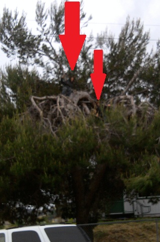
A couple of days ago I was moving to the local grocery store using my most reliable mode of transportation (feet) when I heard a couple of voices yelling “hello, hello!”. I looked around, and didn’t see anybody. My directional hearing is pretty poor… but, finally, I looked up….
|
… and took this picture with my cell phone. These kids were pretty pleased with themselves in their crows nest. Somewhat worried about their future (or that of the human race, with Darwin peering over my shoulder), I asked them, “How are you going to get down?” “Same way we got up,” they replied, gleefully. Huh.Same way they got up.Does that really work?And what in tarnation does this have to do with software?The answer to the first question is “Sometimes yes, sometimes no.” For the answer to the second question… keep reading. |
 |
Data and entropy
Except when a catastrophic event is involved, data usually doesn’t get dirty all at once. What usually happens is that data picks up dirt slowly as it moves through your business processes. A mis-spelled name here, an unnoticed department, or even telephone area code, split there, a shelf full of address changes that don’t get applied when they should.
But… attention to the dirty data usually gets paid all of a sudden, all at once. Budget and resources are suddenly provided, and, as a result, instant cleanup of all types of dirt is expected in one action.
The expectations here are usually your boss’s. S/he may even know a lot about data, but right now s/he has a pressing business need to fix a pressing business problem and isn’t thinking about the data at all.
You can sort-of-fulfill this expectation by applying a number of different data transformations and other cleansing actions in one ETL process. From the outside, it looks like you’ve waved a magic wand and done a single, simple thing to cleanse the data. One click to start that process.
Internally, you know that you’re taking many small steps to go that large distance. More importantly, you know that the analysis to figure out each of those steps was a separate effort.
Most importantly, you know that — however many steps you added to that process — you could always add more, the data is never 100% clean. You start with the low-hanging fruit, where a simple algorithm will take care of a large number of anomalous rows, and you keep going for as long as you have resources.
Wait a sec.
Did I just say most importantly? Actually there’s something even more important: You also know that there are some types of anomalies that cannot be adjusted without user intervention. The most your ETL process can do is point out the data elements that appear to be in conflict to somebody human; it can’t adjust them automatically.
I don’t know how many anomalies of this type appear in your environment, but I’ve got hundreds of examples for you.
Here’s just one: a student’s US enrollment date is > the student’s State enrollment date. This is a physical impossibility, but — assuming both dates pass other checks, such as being within reasonable bounds and in proper relationship to the student’s birthdate and our District enrollment date — our software can’t know which of the two dates needs to be corrected.
It’s easy to say “this should have been validated on input”, but often it’s not and there’s nothing we can do about it now. The typical reasons are integration with an external system and/or a vendor-supplied input interface we can’t adjust.
The answer is to get users involved in the data cleanup.
SSRS and self-service data anomaly cleanup
So it was that I turned my attention to the possibility of using a data-driven SSRS subscription — rather than an inward-facing, SSIS process — to enlist users’ help, and focus user attention, on various identified anomalies.
It’s been pretty successful so far, and I thought I’d write out the details of how it works for you folks. It’s dead easy to do, once you get the hang of it, and even easier to improve over time.
1. Write queries to provide data sets showing the anomalous rows, one query/data set per anomaly type.
These queries are usually very basic. Each one has a WHERE clause that compares two or more elements, and allows you to filter to rows in which this comparison doesn’t give expected results.
Identify some common columns that users will need to pursue every cleanup action, and make sure to include these in every SELECT clause. In our case, this means each data set has a Student ID, a Student Name, and the student’s current School and Grade.
Then, for each dataset, add the columns that need to be compared and evaluated to adjust the anomalous row. These columns, different for each data set, will almost always match the ones in the WHERE clause, plus a few more as background information. Using the above example, I’d include the various dates we have for this student. I might include few extra, such as birthdate, that are not directly involved in the anomaly, if they will offer useful background information.
In some cases — not in the example I’ve given — users will also benefit by having some audit information, such as which user last changed this row. Include these as needed, too.
Each query’s WHERE clause needs at least one common/required parameter to indicate which entity (in our case, school) is going to be sent this data. Remember, this is a data-driven subscription; we’re going to identify a separate recipient for each entity, and only show each recipient the data that their entity needs to fix. This separation isn’t necessarily a security decision in every case, but it is always a “user focus” necessity to do this.
This entity filter is key. If you’re cleaning up departmental data, the Manufacturing department doesn’t need to see anomalies in data edited by the Sales department, and vice versa. You need to ensure the least amount of noise, and the loudest possible signal.
You can add other parameters — which may or may not be used in every single query — as common conveniences. For example, I have one parameter that allows me to set whether or not only active students are reported on. We only provide information on active students to users, because this is all they need to clean up. However, it’s useful to parameterize this filter in case the business needs change, or even if I just want to ensure at least one row per table while testing. I also provide a couple of date parameters expressed as an offset from today, which can be used to subtract or add to any date in any of the queries to filter down to the dataset of interest in each case.
Your engine — a report that’s going to house these queries, and a subscription to drive that report — doesn’t need to know which of the parameters is used by each query, or how they’re used, from a logical point of view. You do, however, need to have reasonable defaults for every optional parameter, and you need to publish what those values are.
2. Create a single report, with one table per anomaly type
Design a really simple table for each dataset. Include a very clear header label for each table, explaining what needs to be adjusted, but other than that don’t do anything fancy, because this is going to be a report subscription (remember?) with an Excel attachment.
It’s best not to overtax SSRS’s native Excel renderer. (Even I use the native renderer, rather than XML+XSLT->SSML, when attaching to an email, to avoid email server filters that think any XML document attached to an email is dangerous.)
You can stack the simple tables one above each other, especially if you are careful to match column widths to keep Excel happy, or you can put each table on a separate worksheet, using a page break. My users prefer the former, so they don’t miss anything without going through Excel tabs.
For consistency’s sake from a user’s point of view, as well as to help keep those Excel column widths the same, it’s also best to keep your constant columns (Student Name, etc) in the same positions, in each table. I put mine on the left, and put the “data to change” elements, which are different for each table, on the right.
Set Visibility values so that if any dataset has 0 rows, the corresponding table doesn’t show. As part of our plan to focus users’ attention, we don’t want them to see an empty table with a “no data” message in this case; we only want them to see tables that need work done.
3. Create a matching function to drive your subscriptions.
So much for the report we’re going to send to users. It’s time to think about delivery of that report. You need a function that’s going to count anomalies for you, using exactly the same WHERE clauses you used for the datasets in the table, and exactly the same parameters that will be used in the report. Mine starts like this:
create function dbo.srcs_fn_DataAnomalyCountsBySchool
( — these are the same as my optional report parameters
— Notice I don’t include the entity parameter, because we’ll
— get data on all the entities/for all the recipients here.
— We can always filter on Entity outside this function.
@IncludeInactives as bit = 0,
@Until as datetime = null,
@YearsAgo as int = 20
)
returns @tblResult table
( Entity int, — we’ll count up anomalies by entity
AnomalyCount int,
AnomalyType varchar(80) — we’ll assign each anomaly type an understandable label,
— similar to what we used in the heading of each table in the RDL
)
as
begin
if @Until is null
begin
— we’ll set exactly the same defaults that we use in the report logic
— to ensure the same results as the report will give
set @Until = dateadd(year,-4,getdate())
end
— the body of the function, filling out the @tblResult variable, starts here.
The body of the function is a union of simple selects. Each one looks like one of the dataset queries, except it provides aggregate statistics by receiving entity (school, in my case) for its anomaly type instead of full details.
— Query/dataset/anomaly type 1, birthdates missing
select Entity, count(*) as AnomalyCount, ‘BirthDates Missing’ as AnomalyType
from EnterpriseTable E with (nolock)
where — conditions under which birthdates are required, if any, AND
— conditions under which the anomaly will “count” towards the total
— in your report run, using those optional parameters;
— in my first type it looks like this, but other query types use none or only one of them:
(
( (@IncludeInactives = 1) and
(E.BIRTHDATE < dateadd(year, @YearsAgo * – 1, E.BIRTHDATE) or
E .BIRTHDATE > @Until) )
or
( (E.BIRTHDATE < dateadd(year, @YearsAgo * – 1, E.BIRTHDATE) or
E .BIRTHDATE > @Until) and (E.CURRENT_STATUS = ‘A’) )
)
group by E.Entity
union
— Query/dataset/anomaly type 2 goes here….
— and so on.
4. Evaluate the function in your subscription code.
The HAVING clause you see below is the tiny trick to making sure no users ever get a report when they have a clean slate:
select B.Email, — more fields here
from
( select Entity, sum(AnomalyCount) as TotalAnomalyCount from
dbo .srcs_fn_DataAnomalyCountsBySchool( DEFAULT, DEFAULT, DEFAULT)
group by Entity having sum(AnomalyCount) > 0) A
join Your_EnterpriseRecipientTable B with (nolock)
on A.Entity = B.Entity
5. Personalize each subscription
Where you see “more fields here” in the code above, you’re going to really work SSRS’s data-driven subscription as far as it’s going to go. Assuming you’re using email to deliver your message, you have a lot of items your data query driving the subscription can set, not just the email for the recipient.
For one thing, your email body is going to be nicely formatted HTML, and it’s going to be personalized with name and other details, such as his or her entity name.
Most importantly, that email body MUST contain the all-important Total Anomaly Count you got from your function. This is what is going to drive your users to succeed and measure their own progress as well as gauging the (small) level of effort it’s going to take them to deal with this every week.
The all-important email body you can personalize is called Comment (ugh) in the Report Manager interface, so don’t overlook it.
The second most important customizable attribute, Subject, is more aptly named. The Subject is how you distinguish your important email from all the other subscriptions this user might be getting (usually with generated subject lines that don’t tell anybody anything).
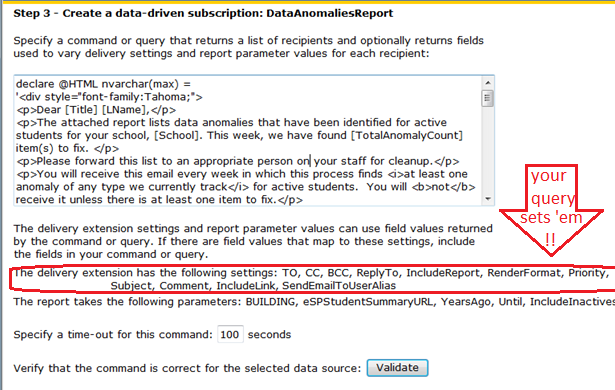
Here’s how that part of my “more fields here” section of the query looks. As you can see in the screenshot above, I’ve set up an @Html variable to be a template for the email body, with token placeholders. I simply use the REPLACE() function to look for those tokens, and give the right results for each recipient. (A function to do this work would probably be smarter.)
Replace(Replace(Replace(Replace(
@HTML ,
‘[Title]’, RTrim(Title)),
‘[LName]’,LName),
‘[School]’,School),
‘[TotalAnomalyCount]’,cast(TotalAnomalyCount as varchar(8))) As Comment,
‘Student Data Anomalies for ‘ + School as Subject
X. Enhance over time
As you can probably tell, you’re going to add to these queries/datasets/tables, and make the equivalent change in your subscription-driving function, every time somebody lets you know about a new anomaly type that might benefit from being included.
Don’t delete any. Even if you think the need for one is passed, leave it in the list. Remember, we’re ensuring that users are not distracted by anomaly types that don’t need their attention. Tables with a 0 count are not visible, and if their overall count is 0 they don’t get the email at all.
Adding over time means that, occasionally, users are going to think they’re “all done” with this and then the notices pop up in their email boxes again. Is this process frustrating for users?
Not at all. For one thing, they’re in the loop, all the time. When you add a new anomaly type, their count climbs back up, but they can see that the problem-to-solve is of a new type. They (gratifyingly) don’t have a long list of tables in front of them, because of all the problems they’ve already solved.
Also, believe it or not, users know their data isn’t perfectly clean. Never ever, no matter what processes are in place. And they know why. They can accept the idea that they’re part of the problem, because they can see that they are part of the solution.
A surprising aspect of this method of delivery is almost an atmosphere of competition engendered by the obvious metric. They know their total number of anomalies, from week to week, they can tell when it’s going down, and they can also tell when there are spikes unrelated to new anomaly types. They are going to want to reduce that number again.
Does it scale?
When I described this process to C, he said “yeah, nice, but it’s not going to work with millions of rows”. If this were a Just-So Story and C were a camel, he would have said “Humph”, but because it’s not and because he’s an Oracle guy, he used the “scale” word to put me in my place, instead.
Well, let’s think about it: we show each recipient only the data that they’re responsible for. (At the lowest level, if we used audit trails, this would be user ID by user ID, and it really could be done).
The data entry which which they themselves are really concerned by definition can’t be more than they can think about or deal with. Of course, of the data entry with which they themselves are really involved, they’re only going to see a smaller percentage that isn’t correct. So, I think this idea does scale. it’s just a question of targetting the anomalies at the right set of users, with the right granularity. (Yours may be a very large organization but each data-entering entity is a small part in it.)
Besides, always assuming there wasn’t one giant mistake somewheres — usually easier to fix, or at least recover from — those millions of rows didn’t get dirty all at once, right?
That data went in little by little, and it got dirty little by little. It can be cleaned little by little too, without being a spectacular burden for anybody, at any time. Eventually, assuming the assignment of responsibility is properly granular in your organization, you’ll catch up.
And here where those boys in the tree come into it.
How are we really going to take down that mountain of dirty data? Little by little. The same way we brought it up.
Hilarious title! Good work