Jignesh recently thanked me for writing (which is always nice to hear) and asked me to keep on doing it (which I hope to do, time permitting).
If you’re a VFP developer, I haven’t forgotten about TMM. I’m working on something for that, albeit slowly.
But the idea in the second section of this post is one of the best examples of reporting synergy that I’ve ever posted.
Please don’t think you can’t use it, just because I’m writing about SQL Server Reporting Services in the first section. And C’s already shown you how to do pretty much the same trick in the first section in VFP-specific code anyway, there are tons of ways to do it.
So, anyway. I thanked Jignesh right back, for the encouragement, and he went on to write:
I was trying to build a graph style effect using simple technique, adding an image(bar) and setting is padding/width property as expression.
Things works fine until you try to export report as an excel file. some how during export, its not able to maintain width of image bar. (all images are 100% in width).
Just wanted to cross check if you have faced similar issue?
Indeed I have. So I’m going to talk a little about the technique that Jignesh mentions here, and how it relates to other stuff I’ve discussed here in the past. I’ll even offer a slight improvement on the usual methods of using it, if you want to use it. Then we’ll talk about an alternative you, and Jignesh, might like to try.
What’s all this about padding an image?
The idea is to create an in-line horizontal bar chart in a table, using a background image for a cell of a detail row. You can pad the right side of the cell using a dynamic expression, forcing the image to show in only a portion of the cell corresponding to the relative size of your measure for this row.
I’m not sure which version Jignesh came across, or who did it first. I first saw this technique here, in an MSDN article and I’ve seen it many places, sometimes more poorly implemented than others. (Here‘s another instance, explaining the same trick, not as generically.)
Lisa’s version of the padding trick
It occurred to me a while back that it might be a better idea to put a rectangle in the cell, rather than simply using a background image for the cell. This way you could caption the bar by overlaying it with a textbox, also contained in the rectangle. I haven’t seen this version anywhere — feel free to tell me if you have — and I think people often forget that containership like this is useful in a table for many unrelated reasons.
In addition to being a slight improvement on the trick and reminding you about containership, this version has the dubious virtue of showing you what’s wrong with the technique even more clearly than what Jignesh experienced!
So I’m going to go through it here. If you already know all this, bear with me.
Quick example
Consider a table of Shipped Units per Calendar Quarter, which might be derived from a query that looks like this:
SELECT
SUM(Order_Quantity) AS Shipped,
DATENAME(Year,Requested_Ship) +
‘-Q’ +DATENAME(Quarter,Requested_Ship) AS Quarter
FROM OrderHeader
GROUP BY
DATENAME(Year,Requested_Ship),DATENAME(Quarter,Requested_Ship)
ORDER BY 2
If you do a quick report, you’ll get Shipped quantities and Year-Quarter values. The Quarter values are going to look like this: 2007-Q3. Just to make my life a little bit more difficult later on, I’m going to group on Left(Fields!Quarter.Value,4) in my report table, although it’s not really germane to the example.
With me so far?
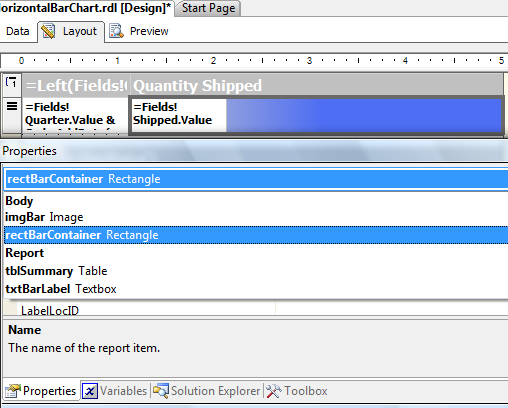
Add a column and drag a rectangle from the Toolbox into the detail row, which will serve as a container for your composite bar.
Drag an image control from the Toolbox into the rectangle container. For this image, assign the Source property of your choice and a Value property that will provide a nice solid or gradient for the bar.
Now you change its Right padding attribute (leaving the other three at 0) to limit the size of the image dynamically.
An expression like this provides the ratio of the current shipped quantity between the max of the shipped quantity for this group. If you want your groups scaled all the same way, use the name of your dataset instead of “YearGroup” in the scope parameter of the Max function in this expression:
Fields!Shipped.Value / Max(Fields!Shipped.Value, “YearGroup”))
What you really want is the difference between this ratio and a full 100% of the width of the cell; that’s the portion of the image you want to block off, so you’ll subtract the ratio you see above from 1. Then you scale that percentage to account for the full width of your cell.
In my case, the cell is 4 inches wide. Multiply inches by 72 points per inch to get the full width of the cell, and you have your full right-padding expression:
= (72*4) * (1.0 – Fields!Shipped.Value / Max(Fields!Shipped.Value, “YearGroup”)) & “pt”
Here’s the enhancement
Because you used a rectangle container with an image control in it, instead of a background image for the cell, you can now drag a textbox on top of your image control, and add a caption. In this example, the expression for the textbox is =Fields!Shipped.Value, of course.

So what’s the catch?
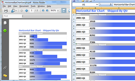
It looks really groovy in HTML and PDF (PDF is showing in the screen shot below, at the left). But Excel can’t do the padding trick properly (see the right side of the screen shot), as Jignesh found out to his sorrow.
What’s more, it can’t overlay the two report controls in the layout, in my containerized/enhanced version, so it adds a row for each label. Sigh.

Enough is enough already with the cute tricks
What have we learned so far? Nothing I haven’t discussed in other posts, I guess:
Different renderers have the right to interpret the RDL instructions however befits their target output format. If you had a CSV renderer, you wouldn’t expect it to handle a bar chart exactly the same way as a TIFF image or a PDF, would you?
As you may recall from earlier discussions here, don’t count on expressions that are pagination dependent being evaluated in the same sequence from renderer to renderer. First, the pagination isn’t going to be the same in each case and second, the renderers may be triggering different behaviors in their page-collecton-handling code. There’s no way to know without testing, and there’s no reason to feel bad about it. (For example, woud a CSV renderer even pay attention to the page collection?)
So what’s the answer? How do you get the same behavior in every rendition?
Head-slapping moment for the week
If you want the renderers to all handle a graphical object the same way (assuming they can handle graphics at all), the renderer of the graphical object has to be outsider the rendering engine that is specific to an output target. It has to be a different engine.
Typically in Windows we do that by making the container object treat the graphical object as an unknown blob, served by some other application.
And what’s the right way to do that here?
As it happens, I had some work-related reasons to think about this on Friday, the same day I had the conversation with Jignesh. I needed a light-weight, easy to use engine to do some graphics without reinventing the wheel.
OMG it’s so easy
Google’s Chart API fits the bill for me. Here’s a quick example (check image properties for the full URL that’s instructing Google to send me this image):
Your mileage may vary — you may need more extensive stuff and have a budget, and there are other packages out there, both free and not.
Or you may want to wrap the API — there’s a project on Codeplex for that express purpose — whereas I kinda like the REST approach in its naked form.
Or you may create a custom report item like the one I created for XMLRSDocs.
In each case, the basic idea remains the same: don’t let the individual renderers render the image if you want the image to be the same in each rendition. Ask some other application to do it.
For my work requirements, I’ll just be bringing the PNG image down and writing it out to disk, to add into some compound document, or attaching to an e-mail, probably.
To show you how this works in a Reporting Services context, I’m going to build some behavior into the sample report we already have, to add an image with a dynamic URL.
I’m going to show these chart images on the group level, because (as usual) the sequence of events for groups didn’t act exactly as I would have expected and I needed a bit more code than expected to show images properly once per group. I’m not actually sure why it was, could be my own fault, but you might as well see what I did to handle it, just in case.
Here’s what we’ll do:
- First, examine the API requirements for the type of chart you want to create (bar chart in our case)
- Figure out what items have to be dynamically built for your chart, whether on a report or group level. In my example that turned out to be three of the name-value pairs in the URL, representing:
- the data value for each bar
- the axis label for each bar
- the data scaling value (min max) for the chart
- Create variables to hold the parts of the URL you want to build dynamically.
- Create a function to store the values to your variables, and invoke that function somewhere in your detail row, passing the required data values to it. In my example, I changed the expression that displayed the quarter name to pass the three data values I knew I needed, plus a boolean expression to figure out whether I was on the first row of a group, so I could zero out the variables on that first row:
=Fields!Quarter.Value &
Code.AddData(Fields!Quarter.Value, Fields!Shipped.Value, Max(Fields!Shipped.Value),
(IsNothing(Previous(Fields!Quarter.Value)) OrElse (Left(Previous(Fields!Quarter.Value),4) <> Left(Fields!Quarter.Value,4)) )) - The Source property for your image is, of course, External.
- The Value property for your image will be a call to another function: in my case, that’s =Code.UseData().
- You need three functions, all told, to manipulate the variables:
- the AddData function you see above, of course;
- a function to zero out the variables at the beginning of a row, if you’re working on a group level (RemoveData(), in my case); and
- the UseData function that puts your variables together with the rest of the URL.
Here’s what my code looks like
It’s really pretty simple. Don’t get too hung up on what you see here. What you’re collecting into the URL is different depending on what type of graph you want to produce, and there’s tons of choice. The literals in the URL are just what I decided to use for this example, after a minimum of fiddling around.
You’ll just figure out what you need, and follow a similar pattern:
Public CHD AS String = “”
Public CHL AS String = “”
Public CHDS AS String=””
Function AddData(qtr As String, shipped AS Integer, max AS Integer, FirstInGroup As Boolean) AS String
If FirstInGroup Then
RemoveData()
End If
If Len(CHD) > 0 Then
CHD = CHD & “,”
CHL = “|” & CHL
Else
CHDS= “0,” & CSTR(max)
End If
CHD = CHD & CSTR(shipped)
CHL = qtr & CHL
Return “”
End Function
Function UseData() AS String
Dim URL AS String = “”
If Len(CHD) > 0 AndAlso Len(CHL) > 0 Then
URL = “http://chart.apis.google.com/chart?” & _
“chxt=y&cht=bhs&chs=500×70&chco=4d89f9&chbh=10&” & _
“chf=c,lg,0,76A4FB,1,ffffff,0|bg,s,EFEFEF&chd=t:” & _
CHD & “&chxl=0:|” & CHL & “|&chds=” & CHDS
End If
Return URL
End Function
Function RemoveData() AS String
CHD = “”
CHL = “”
CHDS = “”
Return “”
End Function
It ain’t ever over ’til it’s over
That’s about it, except for the all-important question: where can you put the image control so that the variables have the correct values at the time the image is fetched from the external application (in this case, Google server)?
It’s no trouble at all if you’re collecting values throughout the “life” of the table; you simply put the image control directly below the table in which you’ve collected those values. Everything seems to work just fine.
When you want the charts on a group level, it’s a different story. Again, this could be something weird in the way I wrote this example, but this is what I ended up doing:
- I created a group header line in which I put the image.
- This group header line consistently was able to produce the correct image for the immediately preceding group. That is: the correct bar chart for group 1 showed in the header line for group 2. Basically it acted like an extra footer line for group 1.
- Because this header row wasn’t useful for the very first group (which had no preceding group) I added a Visibility expression to the row:
=(Left(Fields!Quarter.Value,4) = Left(First(Fields!Quarter.Value,”MyDataSet”),4)) - Once I’d fixed the size of the image the way I needed it be, and had its Source and Value properties set, I copied the image and pasted it to a second copy, directly below the table, to serve as the display of the image for the very last group.
As you’ll see below, I kept the detail lines in, mostly because I was too lazy to figure out how to label both axes properly for this example, but I could have set the Hidden value of the detail row True otherwise.
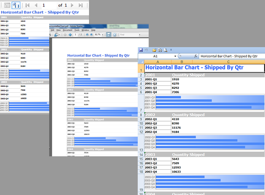
You’ll also see that the configuration of the bar chart from Google isn’t exactly the same as the in-line bar chart in the earlier example; I used a gradient on the background of the chart instead of the bars. Believe me, I could have done it the other way around, and much, much more is possible.
And it works the same way in Excel as in the other renderers ;-).

Some quick reminders to VFP folks:
* — You’ve got multiple detail bands. They’re perfect for gathering the data you need over the course of a group. You won’t have any trouble with this.
* — You’ve got the ability to put dynamic links into HTML.
* — You can preprocess your reports (with no visible output) to GET the images from Google and save them to disk. So you can use them in any output type, if you want to.
Have fun!