This one is a special shout-out to Tom and Wisdom.
Tom writes:
Is it possible to create the charts dynamically in SSRS 2008?
Based on the inputs the number of charts needs to be created. If user select 5, then 5 charts needs to be generated, if 3 is selected only 3 charts needs to be generated. Each small chart is just the same and the only difference is the data that are bound to the chart.
Yes, it really is. And it’s relatively simple to do, even with the details that Tom volunteered later, which required the charts to be ranged across as well as down.
What does that mean, exactly?
Suppose we have a set of survey questions (that’s not T & W’s example, but it will do, for you to imagine the problem). Each question has a range of answers, and the surveys have been asked of a lot of people. We wish to show charts showing the percentages of answers to each question.
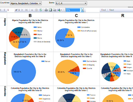
These questions are grouped into sets, and the charts for each set should show on a single line. The user can pick one or more sets (lines of charts) to display.
The user can also select which questions should appear as charts in each line. Suppose, for example, that each set consistes of 10 questions; question 1 in each set measures an emotional response, question 2 in each set is some sort of mental test, and so on. Maybe the user picks questions 2,5, and 7 to look at.
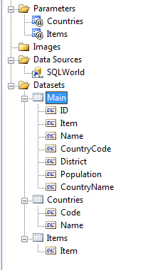
The setup
I don’t actually have a data set like this, so I’ll model it using my trusty SQL World database borrowed from the MySQL tutorials, as usual.
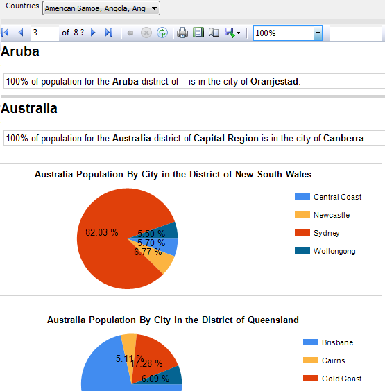
We’ll look at the populations of cities in our charts. Our “survey question set” here, the horizontal dimension, will be represented by the countries in which the cities are found.
|
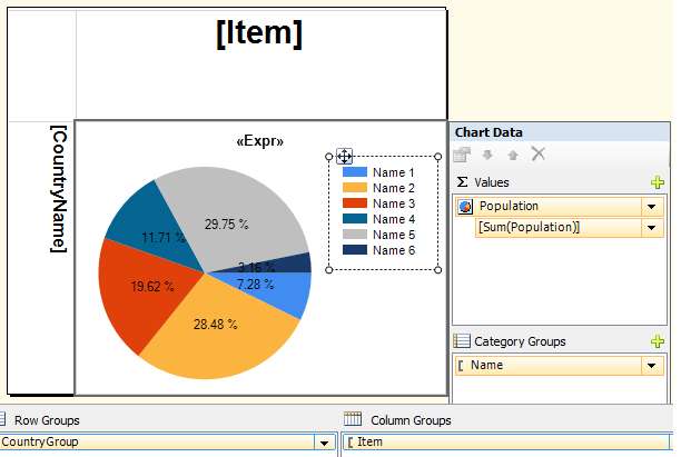
To represent the questions 1-10 in the survey set, and similar to T & W’s actual case, I’ll use the initial letters of the districts in which the cities are located, which I’ll call “items”. Note: this strategy is not germane to the problem, I just needed to find something that all the countries and cities might have in common. Had I used the District names themselves, rather than initial letters, there would be mostly-empty rows, since no District is found in more than one Country. By contrast, in T & W’s data, most of the cells should be filled. So the main query for this report is going to look something like this: SELECT LEFT(City.District, 1) AS Item, City.ID, City.Name, … and you can see the two parameters represented within the query, I hope. |
|
We have ourselves a matrix
This is a classic matrix problem: We’re going to group by Item going across and by Country for our rows. (in the screenshot below, the “Category Group” says “Name”, and that’s the names of the cities that will be shown in the chart.)
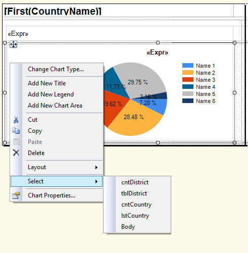
I’m not sure what’s difficult about this, except that maybe people don’t understand that a chart can aggregate data in a cell of a matrix just the way you could aggregate a number in there.
Basically, I think T & W should be able to transpose these directions to their dataset if they remember that the Rows are going to represent the outer group, and the Columns are going to represent the inner group, in their data. (And if not, I think it is *slap* time…)
Don’t overcomplicate this more than you need to
There are some alternative ways I’ve come up with to put tables in a row, using row_number() and mod to figure out what details go where. But the matrix fixes that problem with no work at all.
If you don’t need a matrix, because you don’t need a horizontal dimension, things are even simpler. Just use a List for your outer grouping (in our example, Countries), and embed a tablix in it for the inner grouping. In this example, I used the entire District name because I didn’t have to worry about commonality between Countries, and I also conditionally hid the graphs, replacing them with a textbox, if the reporting function CountRows() told me there was only one city in the region.
… this works spectacularly well.
And that’s really all I wrote. OK?
Forgive me for being scarce around here lately.
Lots to do, lots of family events, and a trip to plan. I have a list of topics stacked high up. As folks seem to have noticed however, you can ping me email and I’ll try to help you out if I can. And I’ll try to generalize it, later, as a blog post to help other people if the situation warrants.
Emailed questions are one thing that is stacking up my list of topics. Another is the fairly interesting work problems I face every day. If I can get my head above water, I think I’ll rant about the ReportViewer some more, real soon.
Good luck out there, everybody…