The title of this post is a reference to one of the most viscerally powerful songs I know (if you’re in the right frame of mind). It probably comes to mind because of the horrible grubbing that C and I have been doing in the garden. You really don’t want to know what these things look like, IMHO, but if you think you do, you can see pictures in this article. We’re still at the stage where we hope to be able to “till and hand-pick” our way out of our planter infestation, but I have a feeling we’ll have to go with the “beneficial nematodes” strategy, eventually.
It’s also an expression of the state of my current code investigations.
Today I’m opening up a new category on this blog to discuss DAX and Power BI. Unlike the other technical categories on this blog, these are not areas in which I consider myself an expert; I’ve been writing DAX in support of data warehousing and tabular models for about 3 years, but I’ve never had an opportunity to work with Power BI professionally until now. It’s always been “SSRS all the way down” — and I’ve loved every minute of it.
In fact, half the time as I start out with Power BI, my work seems to consist of questions like “how would I do something I do without breathing hard in an RDL, in a PBIX.” Accompanied by a great deal of gnashing of teeth.
So, when I tag posts with this category, I don’t pretend to be mentoring you, I’m just sharing what I learn, as I go.
And I hope whatever I share doesn’t turn out to be boring or… buggy.
A little setup
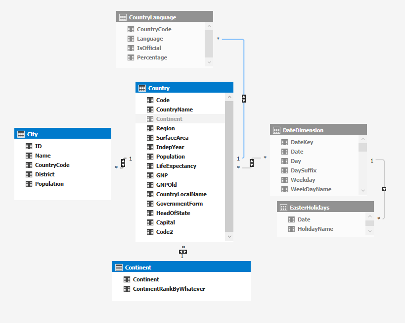
For my data references, I’ll continue to use my usual SQL Server adaptation of the standard MySQL World database, but I’ve put a small tabular analytic model on top of it to work out my DAX questions.
A few notes about this tabular model:
- In this screenshot, I’ve “hidden from client tools” the entities that I won’t be using for our current discussion.
- The DateDimension doesn’t really belong to the World db, but I wanted to check what the horrible Visual Studio 2019 syntax would look like to add a table-valued-function as an entity, which is why you see EasterHolidays. (Predictably, the syntax is dreadful, but it worked just fine.)
- The CountryLanguage entity isn’t a great candidate for what I wanted to do in this post without adding a compound key, and I found that distracting in the examples I was trying to prepare.
- I normalized out the Continent value from Country, which isn’t a separate table in the World database, just to make the desired 3-level hierarchy as clear as possible.
What I learned last week: Hooray for HTML-Content visualizations in Power BI, they’re lots of fun.
Specifically, hooray for Daniel Marsh-Patrick, who wrote the durned thing, and James Mazzanti, who demonstrated it in a really fun presentation.
In working with the visualization control myself after the presentation I set myself a couple of goals:
- could it reference external resources? (This would aid reusability.)
- how much scripting could I do? (This might provide some degree of interactivity, which is a thing you mostly lose when using this visualization, in comparison with “standard” Power BI or RDLs.)
I immediately found that I could embed an external CSS stylesheet reference and the styles would be respected, much to my delight. This goes a long way towards not cluttering up my measures, providing reusability, and ease of maintenance.
Here’s an example measure that can be used as the source for an HTML-Content visualization, similar to what I showed James after the presentation. You can use it yourself with your own dataset, to try out the content.
HTMLMeasureStyleSheetReferenceInDummyTable =
"<link rel='stylesheet' "

&
"href='https://spacefold.com/"
 &
"wp-content/themes/twentyfifteen/style.css?"


&
"ver=5.8.2'>"

& "<UL class='main-navigation'>"
& CONCATENATEX (
  CALCULATETABLE ( 'WorldTabular',
   WorldTabular[[LevelName]]] = "Country" ),
   "<LI>" & WorldTabular[[Country Name]]] & "</LI>",
        BLANK (),
        WorldTabular[[Country Name]]]
   )
 & "</UL>"
Why the “DummyTable” as part of the measure name? So I could remind myself to think about whether these measures should be tied to a single row, single column entity in the model or actually tied to (one of) the real entities that may have sourced this string expression. Dunno the answer to that yet. There might be a perf benefit, and it might be a primitive way of grouping these measures into a library.
Why the multiple brackets? Dunno. Might be doing something wrong, but this is what worked.
Why the filter on LevelName, in fact what is LevelName? Stay tuned to the second part of this post, on RollupGroup usage.
Note that the CSS file happens to be on spacefold.com, because I happened to know the names and locations of files there, but the styles showed up perfectly well both in Power BI Desktop and when I published my report to the cloud. They will for you, too if you use the same spacefold CSS reference. Take the class out and see the difference, and then take the link to the stylesheet out, to see default behavior.
In my next experiment related to external content, I learned that I could stick an IFRAME into a Power BI report, too — this could definitely aid re-use . There were definite limitations:
- The iframe content didn’t appear in the Desktop, but could appear when the report was published to the cloud nonetheless.
- Some sites aren’t going to allow themselves to be put in an iframe (for example, an error such as Refused to display ‘https://www.google.com/’ in a frame because it set ‘X-Frame-Options’ to ‘sameorigin’ might display and there are other methods sites can use.) So, you have to know your source(s).
- Power BI seems to allow https src values but not http values in an iframe, but this could have been accidental. I didn’t test thoroughly enough to be sure.
- I didn’t see links in the original page allowing me to go visit additional sites and pages — again, not thoroughly tested, so not sure.
Because some external resources can (obviously) be accessed, this control isn’t MS-certified, and (as Daniel notes) it won’t be. I don’t think that’s a big deal, but obviously with power comes responsibility. I’m talking to you.
Finally, I began to experiment with javascript.
So far, I’ve found that some inline scripting works — even in the Desktop designer, curiously enough — but I haven’t been able to call a function embedded in the measure string. To show you what I mean by inline scripting, I mean a method such as onclick will work, and this example demonstrates that the dom model is intact, from what I can see. I did some more extensive object tests after this one and everything appeared to be fine:
HTMLMeasureInLineScriptStatement =
VAR quot =
    UNICHAR ( 34 )
RETURN
 "<h4 id='h4name'onclick='"
 &
"document.getElementById("
 & quot & "h4name"
 & quot & ").innerText = "
 & quot & "got here!"
 & quot & ";'>Click This </h4>"
The quot variable gets around the fact that you need two levels of quotation marks in the embedded javascript. I believe you can do this in DAX by escaping the quote character directly as well, but I think this is a bit easier to read.
I can’t seem to generate a working javascript function within an HTML-emitting measure block, though; for example this doesn’t work, at least not for me:
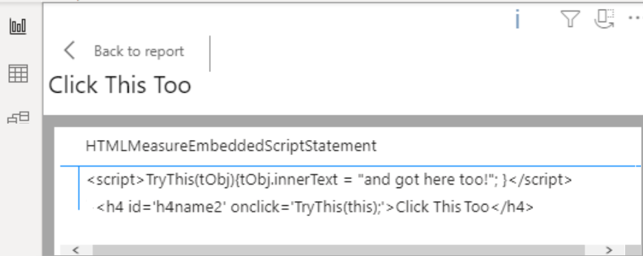
This isn’t entirely surprising; it makes sense that HTML-Content might strip out this type of script (Zoho Analytics, a platform I really enjoy twisting around to do strange and stupid pet tricks, does exactly the same thing).
But, given the fact that I could call an external stylesheet… can I do the same with an external script?
Nope, apparently not. Well, it was worth a try. Here’s my brain-dead test example in case you want to give it a go:
HTMLMeasureWithExternalScriptReference =


"<script "

 & "src='https://spacefold.com/test/test.js' "

 & "type='text/javascript'></script>"

 & "<h4 id='h4name2' "

 & "onclick='TryThis(this);'>"
  & Click This Too</h4>"
You can prove that the script is working by putting the contents of a measure in a simple test.html file, and you can verify exactly what the script does by downloading it. But you can’t get it to work in Power BI, at least I couldn’t. Let me know if you can!
Oh well. This is not just a stupid pet trick. It would have been worth it — trust me — but, even with in-line-only scripting, I may give this another go sometime, to obtain a small amount of interactivity.
Or… maybe I just need to try it in a different browser than Chrome? I noticed that the Power BI Cloud server visualizations had some very strange behavior in Chrome, especially when changing zoom level. Maybe that was just the HTML-Content control.
There’s a thought for more experiments.
What I hope to learn this week about DAX: Rollup/RollupGroup — or maybe not?
I’m partially writing this post in hopes of getting James to teach me a little more :-).
While he was working out an HTML table with “pixel perfect formatting” for his demo, he used DAX Rollup to handle the different levels of aggregations. Now, I gotta tell you, I have never gotten Rollup and RollupGroup to do exactly what I want them to do. And it seemed to me that James was jumping through quite a few hoops, himself, to get the result he wanted in his HTML table.
So I told him I would write something to show how I do it, which doesn’t use the native functionality and has always seemed a bit more controllable to me. I use it all the time in specialized RDLs that have to follow some arcane compliance reporting requirements.
For both of us, the work does require some monkeying around to get the order you want, but I swear mine seems to take less.
So, James, here’s my ROLLUP-less rollup, using the World data, the way I would do it directly in the analytic model normally. It’s a bit long, but the code is very straightforward. The main idea is to use a UNION for each of your level of aggregation, and dummy up some of the columns in each:
DEFINE
    VAR BottomSortVal = "ZZZZZZZ"
/*
  doesn't really matter what this is,

  whatever will sort to the bottom with your data,

  assuming you're trying to get the aggregations and subtotals

  in footers rather than headers.

  If you want the subtotals as headers, you probably

  don't need it, and you don't need the "Display...Name"

  columns added either.

*/
    VAR Spacer =
        UNICHAR ( 32 )

EVALUATE
ADDCOLUMNS (
    UNION (
        SUMMARIZE (
            'Continent',
            Continent[Continent],
            "Country Name", BottomSortVal,
            "City Name", BottomSortVal,
            "Count Countries", COUNTROWS ( Country ),
            "Count Cities", COUNTROWS ( City ),
            "Total Population", SUM ( City[Population] ),
            "LevelName", "Continent"
        ),
        SUMMARIZE (
            'Country',
            Continent[Continent],
            Country[CountryName],
            "City Name", BottomSortVal,
            "Count Countries", 1,
            "Count Cities", COUNTROWS ( City ),
            "Total Population", SUM ( City[Population] ),
            "LevelName", "Country"
        ),
        SUMMARIZE (
            'City',
            Continent[Continent],
            Country[CountryName],
            City[Name],
            "Count Countries", 1,
            "Count Cities", 1,
            "Total Population", SUM ( City[Population] ),
            "LevelName", "City"
        )
    ),
    "Display Country Name",
 IF ( [LevelName] = "Continent", Spacer, [Country Name] ),
    "Display City Name",
 IF ( [LevelName] IN { "Continent", "Country" }, Spacer, [City Name] ),
    "Display Count Countries",
        IF (
            [LevelName] IN { "Country", "City" },
            Spacer,
            FORMAT ( [Count Countries], "#,###" )
        ),
    "Display Count Cities",
 IF ( [LevelName] = "City", Spacer, FORMAT ( [Count Cities], "#,###" ) ),
    "Display Total Population", FORMAT ( [Total Population], "#,###" )
)
ORDER BY
    [Continent],
    [Country Name],
    [City Name]
I thought maybe I couldn’t use this in Power BI data queries from some reason, but it seemed to work fine. My data table in the PBIX, named WorldTabular, is the result of that query.
It made the ordering situation pretty simple. You’ll see that, in the last section of this post.
So, James, is the problem that I’m still (after several years of use, but not a lot of concentrated thought) such a novice with DAX that I do everything the hard way? Is ROLLUP really better/more performant/worth the anguish I’ve spent over it? Looking forward to finding out :-).
Putting it all together
James mentioned that he wanted to go further in his technique with a non-scrolling header, since the table might be very long and not show completely in the initial view. He probably has a good way to do that but didn’t have time to show it.
I thought I would take advantage of the query I wrote above and go ahead to implement it myself as a “test at the end of the chapter”. There are a lot of possible CSS options — start here — and I’m very well-versed in fancy HTML generation, although I normally do it using XSLT — but my aim was to do learn more about Power BI and the HTML-Content control use.
Actually, there’s a thought. Is there a Power BI control that would allow me to address the contents of a dataset or datatable, presumably as currently filtered or sliced and presented as XML, with XSLT and show the result? Would love to do that.
It turned out to be dead easy. All it takes is two adjacent, HTML-Content visualizations that have been left-aligned with each other.
Referring to the two measure code snippets immediately below, you can see how it would benefit from the use of some external CSS, and of classes in general, rather than in-line styling, so that things don’t have to be repeated in multiple places. I will skip showing that type of refinement in this example, to emphasize how the styling for each of the two visualizations — here, mostly restricted to the sizing of the columns, plus a couple of empty columns between the numbers — is kept in synch.
This first measure does the table header:
HTMLTableHeader =
"<table style='border-style:solid;border-width:1px;border-spacing:0px;'>" &
"<tr bgcolor='silver'>" &
"<th width='100px'>Continent</th>" &
"<th width='100px'>Country</th>" &
"<th width='300px'>City</th>" &
"<th width='50px' align='right'># Countries</th>" &
"<th> </th>" &
"<th width='50px' align='right'># Cities</th>" &
"<th> </th>" &
"<th width='150px' align='right'>Total Population</th>" &
"</tr></table>" The second measure does the table of rows (sans header). If I remember correctly, James used multiple classes, in his example, to highlight the summary rows. Instead, I’ll use an explicit bgcolor row-level attribute for the subtotal or summary rows, again to be sure you can see the logic in-line without abstraction, or distraction:
HTMLTableWithSummaries =
"<table style='border-style:solid;border-width:1px;border-spacing:0px;' >"
& CONCATENATEX (
WorldTabular,
"<tr " &
Switch(True(),WorldTabular[[LevelName]]] = "Continent","bgcolor='aliceblue'",
WorldTabular[[LevelName]]] = "Country","bgcolor='lemonchiffon'",
1=1,"") &
"><td width='100px'>" & WorldTabular[Continent[Continent]]] &
"</td><td width='100px'>" & WorldTabular[[Display Country Name]]] &
"</td><td width='300px'>" & WorldTabular[[Display City Name]]] &
"</td><td width='50px' align='right'>" & WorldTabular[[Display Count Countries]]] &
"<td> </td>" &
"</td><td width='50px' align='right'>" & WorldTabular[[Display Count Cities]]] &
"<td> </td>" &
"</td><td width='150px' align='right'>" & WorldTabular[[Display Total Population]]] &
"</td></tr>"
,,WorldTabular[Continent[Continent]]],ASC,
WorldTabular[[Country Name]]],ASC,
WorldTabular[[City Name]]],ASC) & "</table>"
Once again, I’m probably doing something really stupid that requires all those extra brackets. No idea.
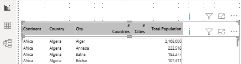
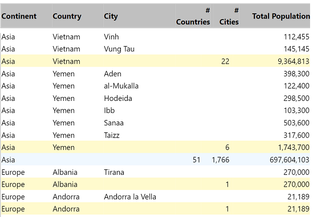
Here’s the result. You can see the Country and Continent-level summary lines in LemonChiffon and AliceBlue, respectively, with the City (detail) level in black and white. I realize it’s hard to see that the headers are frozen, but you can see that we’re down into the end of Asia and starting Europe. All of Africa and Antarctica came first, so if the header was scrolling you wouldn’t see the header here:
What else works?
Ctrl+F (browser Find) for a start, when you’ve published to Power BI in the cloud (not in Desktop, of course, because it’s not a browser) — whether the content is physically showing in the visualization or not! That was unexpected! To make the screenshot above, I did a browser-level Find for Europe, and “jumped” the table down to the subset of data you see here. Scrolling through the rows would have been pretty tedious.
Probably lots of other things work, too.
Probably lots of other things don’t work, too. For example, each little visualization is an island unto itself, no matter what we might think is bound together, when we look at that HTML table, header and rows. You can’t make a reference to a stylesheet in one HTML-Content item and reference its classes and other instructions, in other HTML-Content items, even if they are on the same page, in the same report. And that makes sense, at least to me.
I can’t wait to grub around some more.