Areas of Interest, as counted by my cat
I originally wrote the article below in 2007 as a series of web posts on a different blog. Now that Cakewalk’s SONAR X2a has recently been released with support for Windows 8 touch technology, I think this proposal is more appropriate than ever, so I’ve updated it slightly.
I Hate Knobs – a modest proposal for new standard UI controls
I’ve recently upgraded my music studio software to a new release of the Digital Audio Workstation “SONAR” by Cakewalk, Inc. I’ve decided to share my thoughts about the path the UI development has taken:
An Open Letter to Cakewalk on SONAR X2 Producer – my thoughts and recommendations
I have a new favorite programming font: Damieng's Envy Code R.
My old favorite was Microsoft's Office 2007 Consolas, and my initial reaction to Envy Code R was that it wasn't as readable. But very quickly I decided I liked it more. It looks great with ClearType smoothing, it looks good at ridiculously small point sizes, and the O and 0 characters are distinct.
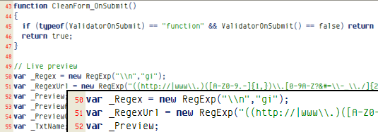
Microsoft Excel gave L a good one yesterday:
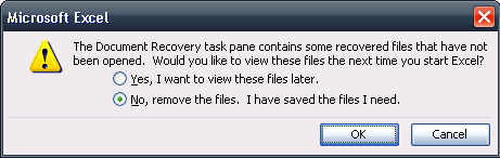
What happens if you press “Cancel”?
I’m happy to know that Visual Studio .NET 2008 (“Orcas”) is going have the HTML designer from Expression Web built-in. It’s much better than the editor in VS 2005.
Unfortunately my copy of Expression Web appears to be missing the third checkbox in the CSS options dialog, shown below:
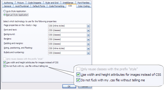
Can anyone tell me where to find it?
This used to be a series of blog posts but now it is a shared Google Doc.
Link: I hate knobs
My current laptop is running Windows XP Media Center Edition. It came pre-installed, it wasn’t really my idea of a good time. (At the time, my understanding was that it would come with a free upgrade voucher to Windows Vista Business. This turned out to be Vista Home Premium instead. Either way, Vista will never be installed on this machine.)
So MCE doesn’t really allow you to “lock” your desktop. That feature isn’t in the OS. Instead, when you attempt to lock the desktop with the WinKey-L combination, you get the “switch user” screen. OK, maybe not so bad, you still have to enter a password to get back in to the desktop.
What I find very annoying is that you can see how many unread emails the user has. Even if Outlook isn’t currently running! It’s things like this that make me want to switch to Thunderbird or some other non-MSFT email client.
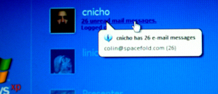
Considering I want to leave my laptop open, but locked, in my cubical while I am away from my desk, I really don’t like having information spewed out like this. It gets worse: if you hover the mouse over the current user icon, you can see their email address. Who thought that one was a good feature to implement?
I know, I know, the glib answer is that I shouldn’t be running a non-business grade OS on a business laptop. Windows XP Professional would give me the security I want. It’s my fault for deciding I could live with Windows XP Media Center edition on my work machine. These are the trade-offs.
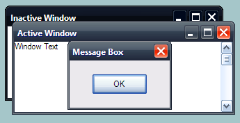
It could be that one of the reasons that I find the new user interface in Windows Vista to be so distasteful is that I run Windows XP using the best theme ever: Royale Noir:
I find this so pleasant to work in that anything else looks like crap. It’s not exactly an official theme, but you should be able to find it with a little bit of work if you google “Royale Noir”. The best theory I’ve read about it so far is that it is an early version of the theme released with the Microsoft Zune media player software. In my opinion, Microsoft should have stopped at Royale Noir because the final Zune theme does not compare favorably.
The U.K. periodical Windows Vista Magazine* touts the following as a “great new feature”. It’s the “warning you are overwriting a file of the same name” dialog:
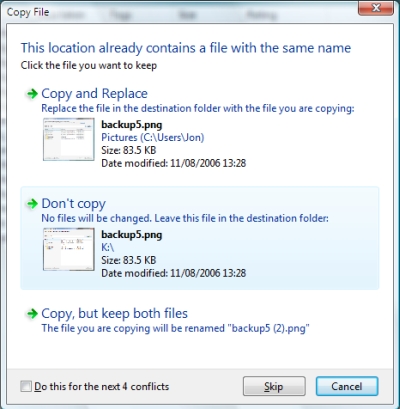
One major difference from XP here is that instead of being interrupted as soon as the conflict is detected, it will copy everything else and then ask you what to do about the conflicts at the end. I’m not the only person to think this dialog could be improved, but in my opinion, there are so many things wrong about this dialog that I’m going to discuss each of them. The first is process-related but the rest of them are UI related:
1. I’d really like to be warned of the conflict before the files are copied.
It’s possible you expected to overwrite some files, but I’d suggest that most of the time, this dialog comes as a surprise. What are the chances that in this case, you don’t want to do the copy operation at all? I’d say they’re good. I’ll take 50/50. Maybe that’s what the Cancel button is for.
2. What happens if you press Cancel?
Can you tell? It’s not obvious. The dialog goes away, but all those other files have still been copied. Were you perhaps expecting the operation to roll back? I was. What if you press Skip?
3. “Do this for the next 4 conflicts”
The number 4 actually reflects the total number of conflicts. So why doesn’t it say, “Do this for all 4 conflicts” then? Then I wouldn’t be concerned about whether I should worry about a fifth or sixth one.
4. How many font & color combinations do you need for this?
I count at least 4. And my eyes hurt. This is symptomatic of the failure of the UI designers currently working on Vista.
5. Transparent window borders are *ahem* clearly a mistake.
I mean, really. Just look at the screen shot. I have enough trouble with my eyes as it is without Vista deliberately fuzzing things for me. Microsoft’s Vista web site describes this effect thusly:
A noticeably new element of the Aero experience is the translucent effect of Aero Glass, featuring dynamic reflections and smooth animations. The glass windows create an open, lightweight environment – and more importantly, help you to better focus on your content, rather than on the surrounding interface.
That explains why every review I’ve seen of Aero Glass focusses on the “cool transparent window borders”. Ok, cheap shot. Let me just disagree and say that the transparent effects do not do it for me. And remember – assuming your laptop has video hardware capable of rendering the nice effects, you can enjoy it for all of 30 minutes while the battery lasts, while burning the palms of your hands. (Fancy rendering = work = heat, you know.)
Now, kudos to Microsoft for trying to fix the deficiencies of the same dialog in XP:

But I award zero points for execution. Sorry.
* Seriously, how long has this magazine been in existence, do you think? And just how unbiased editorially can they afford to be?
© 2025 More Than Four
Theme by Anders Noren — Up ↑
Recent Comments