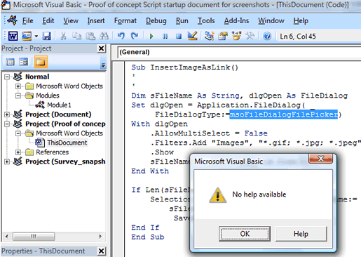
No rest for the wicked, apparently.
I admit to having given C some ammunition on this subject, from time to time, but I really try not to rant too much about UI in this blog. I also try not to complain too much about MS documentation in general, having some sympathy for the User Ed people or, more specifically, the conditions under which they do their work. Actually I try not to discuss MS documentation at all, unless it's some docs I personally had something to do with.
I don't even have an MS Office category on this blog. I rarely talk about macro-oriented Office development. I don't like admitting that I do a ridiculous amount of VB macro work on behalf of users or when — as today — it looks like it might help make a team member's documentation work more efficient.
But this one's a classic. Is there any way the addition of a "Help" button in this dialog could be more pathetic?
