It's been a month since my last post. I have some excuse; C and I have moved again, we've found a place of our own in Marin (we've been looking since we joined EC|Wise last fall).
We're nicely settled in, now, thank you for asking, and I can dig my computer out of the rubble.
What took so long to accomplish a simple local move, you ask? Why, the need to continue with real life (and real work) during this period.
As part of what went on during my Blog Hiatus, I did a presentation required me to envision, and display, a fully-realized Reporting Solution that didn't yet exist.
I bet this has never happened to you. OK now I will SET SARCASM OFF.
As part of preparing it, I quickly and lightly "branded" a Reporting Services site to serve as the host for some demo reports I whipped up. In reality, we rarely use Report Manager as the vehicle for our reporting solutions, but this did the trick.
And while I was doing this, I said to myself (with no sarcasm at all), "I bet this is something a lot of people don't know how to do".
If you do know how to do it, read no further.
Or maybe you, like me, generally host RS content in your own interface, in which case this walkthrough probably won't help you except in the aforementioned "do this demo immediately" scenario.
Or maybe all of your clients have happily moved to RS 2008 already. Perhaps this is no big deal at all in RS 2008? You tell me — I haven't checked it out. ("Come a day there won't be room for naughty men like us to slip about at all…So here is us, on the raggedy edge.")
But if I've bet right, in your case — you don't know how to do this, and you might want or need to — keep reading, now you will.
Ready? This screen shot shows you what we start with.
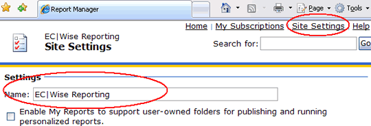
Step 1: Fix the site name.
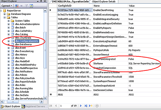
This is really easy. You can do it through the ReportServer db, or you can do it through the Report Manager configuration pages.


Step 2: Fix the Report Manager styles.
This one is not as easy, but almost. Adjust ReportingServices.css in the appropriate location :
Take a copy of the "real" style sheet first, and keep it safe, obviously! Don't bother trying to point the Report Manager to a file with a different name. You'll still have to do something similar later (see next step) but don't waste your energy here.
At this point in your work, things are starting to look a bit better in Report Manager land…
… but as you can probably see, especially when you demo reports, you still have a ways to go.
Step 3: Fix ReportServer CSS styles.
When Report Manager hosts a report, it's really getting some of its presentation information for the embedded report from ReportServer. We need to synch these things up. We'll start with the ReportServer CSS stylesheet.
This step is similar to the last one, but in my experience you have to do two things, and both are needed. If you don't do both, it looks like RS uses an internal version of its default HtmlViewer.css:
-
Create your own CSS with a different name (say, MyHtmlViewer.css) based on the default HtmlViewer.css that ReportServer uses.
-
Add a node referencing this new name to RSReportServer.config:
<HTMLViewerStyleSheet>MyHtmlViewer</HTMLViewerStyleSheet>
Now we're getting somewhere. But we're clearly not done.
Step 4: Fix the Report Manager images.
The last screen shot shows you that ReportServer and Report Manager don't take care of everything by CSS. You need to clone a couple of images, too.
In this branding exercise I've deliberately changed the toolbar color significantly, so I'll need to change the toolbar edge GIFs provided by Report Manager to match. I'll also change a few of the top-left icon images to match my vision for this site.
This screen shows you the location of all the images, and also all four images that I chose to edit for this walkthrough. There are two "toolbar edge" GIFs and two top-left icon JPG file:
- toolbar_edge_top.gif
- toolbar_edge_bottom.gif
- 48folderopen.jpg
- 48report.jpg
How many of the top-left icon images you choose to edit (especially if, like me, you are not thinking about using this interface in Production) depends mostly on how many of the Report Manager pages you think you need to show in the demo. The two I've chosen here are really the main two. Don't fuss too much about the administration and configuration page icons unless you know your customer has some specific need they address.
In this next screen shot, you can see the results as I showed them in the Report Manager report-navigating interface…
… and here you can see how they appeared when running a report:
So.. we're done. See how easy?
OK, OK, it can be even easier. And a lot prettier.
For this walkthrough, I deliberately changed the color of the toolbar. It looks pretty ugly, but the toolbar edge part happened to be the hardest part to figure out so I wanted to make sure you had that part in-hand. It's also difficult to do perfectly; for this walkthrough I haven't really blended the colors properly. (I did a better job in the real presentation.)
But you can do this a lot easier (and not touch the two toolbar edge GIFs! ) simply by keeping the default toolbar color its nice tawny light brown, and changing the active tab color to match it. Let's go back to the original "before" picture, and consider the dramatic difference that might make.
The default interface contrasts between the active tab and the toolbar, for no good reason. Matching the two, especially if you can find a way to do it with your client's color palette, dramatically streamlines the look of Report Manager as well as reducing your "branding" work.
Here's an example, from our last gig in Vegas:
… I think the result is much more sophisticated looking than the default RS colors and contrasts.
What do you think?
Hope you enjoyed this little look at the world of RS Branding. If not, drop me a line and tell me what else needs explication. I'll try to post more frequently in the future.