A good long while ago, I wrote a blog post about re-branding the Report Manager interface. While at the time I thought it was not all that useful, because most developers create a custom interface to embed RS in their programs rather than actually show Report Manager to anybody, it’s become clear to me that Report Manager is very handy for administrators. There’s really no reason to re-invent the wheel by making all the appropriate SOAP calls into Report Server to re-write the manager interface, when administrators need to do lots of quick and dirty configuration behind the scenes.
I also find that the branding tricks are a useful reminder of exactly which RS instance you’re working with, when you have a number of them floating around for different purposes.
FWIW, I do the same thing for Sharepoint interfaces; even when a client isn’t going to see them, it’s handy to rebrand various sites, each set up fairly consistently, so that I know exactly what I am posting where without having to look at a bunch of breadcrumbs.
So, with this in mind, I continued using the branding practices that I recommended in that earlier post, after we migrated to RS 2008. They continued to work just fine.
Or, we could talk some more.
I didn’t expect anything different when RS 2008 R2 came along. Well, I was right and I was wrong.
The good news is that the native interface is much less ugly. Maybe some of you will feel less of a need to improve or re-style it than before, as a result.
The other good news is that the general instructions I gave you in the earlier post are still right. You still have to make the same config changes (which are minor) and look in the same places under ReportServer and ReportManager to make your CSS and image changes.
The bad news is that the CSS and the actual images in use have changed significantly, and you can’t just plop your earlier images and CSS into the new folders and expect anything to work. Although this time I knew what to do, without a bunch of false starts and experiments, I still had to re-do it.
Given, as I said, that I want to re-brand all my Report Managers to keep them visually distinct from each other, and given that these sites are not exposed to end users, all I wanted to do was (1) get it done and (2) get it done. I didn’t want to fuss.
So, I’ve resolved the process into (I think) the smallest number of steps and, herein, I share those steps with you.
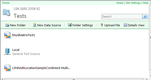
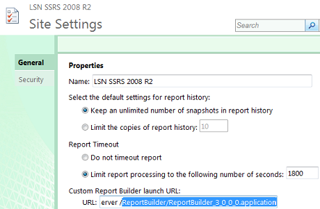
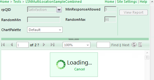
First, here’s a preview of the result you can expect from following these steps. If you haven’t looked at R2 yet, you’ll see that Report Manager now has a distinctly SP-modern appearance, much more pleasing, which I have not introduced (it comes this way out of the box. All I’ve done is font- and color-brand it. As I’ve indicated, I’ve done it very quickly — but notice the branding is consistent all the way through the report run, even unto the “Wait” message:
1. Formulate your general strategy for the brand
In my case, aside from changing the name of the site, this largely involves setting a base color to be different from the default blue (green, in this case) and picking the font I wanted to use.
I also looked into the accent colors used for different elements, and determined that the “gold” color used as a secondary color would need to be changed to go with my new base. Since I wasn’t using blue as my base any more, I decided I could use it as my secondary accent color, instead. You can see it in the folder and data source icons, above.
2. Carry out your color and font strategy through the CSS files
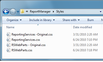
There are a couple of different CSS files in the Report Manager and Report Server Styles folders; change them all, even the ones you don’t think you need, and change them throughout, even if you think not all the classes are currently in use. This will be easier than it sounds.
The places to find these folders are exactly the same as they were before — refer to the earlier post for full details on how to find, and how to treat, them.
2a. Figure out a good way to exchange base color components
You can either look at every color value in the CSS files, or you can cheat. Here’s how I cheated:
-
I did a Find in my favorite developer tool, Visual Notepad, for every mention of “color” in the CSS files.
-
If the color was expressed with digits, I swapped the middle (or “G”) pair of digits for the final (or “B”) pair of digits, and left the first pair (“R”) alone.
For example, a color pair such as #dee7f2 in the Report Server HtmlViewer.css became #def2e7 in my version. I just went through each item and changed it without worrying about anything, including whether it was foreground or background, and you could figure out a similar way to swap the color values no matter what your base color is, I bet. -
If the color was expressed as a non-digit value, such as Blue, I swapped it for what I thought belonged instead (in my case, Green, duh). There are a few of these.
-
-
Then I did the same thing for the word “border”, since this is where you’ll find colors used in the CSS files without the word “color” being attached to them.
2b. Do a search and replace for font-family.
This one is really easier. I switched everything to the font I wanted, and I think that’s really all I did except for changing font-weight from bold to normal in a couple of places.
3. Fix the images referenced in the CSS files
You will find a number of images referenced in the CSS files; you can find them all by searching for “url”.
The entries look like this:
background-image: url(Reserved.ReportViewerWebControl.axd?OpType=StyleSheetImage&Name=toolbar.jpg)
or like this:
background-image: url(“../images/toolbar_top_lightsteelblue.gif”);
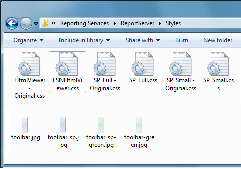
… depend on the file. Don’t worry about the difference. You’ll find these images easily in the relevant directories; you can see the first one in the ReportServer Styles folder screen shot, above, in fact. Here are some more examples, with the files I added “starred” in the screen shot:
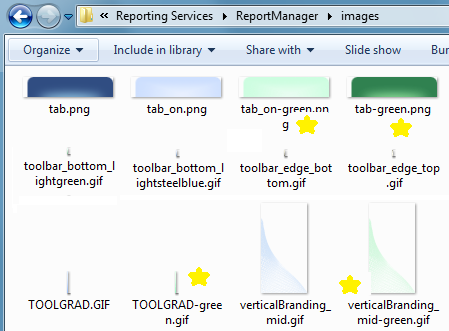
To achieve the right effect, all you need to do is:
-
Make a copy of each image, with a name that makes sense for your color scheme.
-
Change each of these images using a similar strategy to what we did for color pairs: alter the hue and saturation according to some set scheme — this will depend on what tools you use for the processing, but you can usually do this by percentage — and do it consistently for each file.
-
Change the “url” references in the CSS files that you’ve created, to point to the new images with your new names, for example:
background-image: url(Reserved.ReportViewerWebControl.axd?OpType=StyleSheetImage&Name=toolbar-green.jpg);
or like this:
background-image: url(“../images/toolbar_top_lightgreen.gif”);
You’re almost done….
3. Fix the images not referenced in the CSS files
Set the ReportManager\images folder up to show thumbnails or large icons, and just scroll through the folder. You’ll see lots of images that weren’t referenced in the CSS file but are magically used in Report Manager views. For these, we need to alter the images with the exact names that they have out-of-the-box, so just make a copy of any one that you don’t like. Now you can safely edit the ones with the original names.
As I mentioned, for my use this turned out to be all the ones that made heavy use of the “gold” secondary color, which I determined that I would replace with blue.
As you did above, edit all these files with a consistent change of hue and saturation for each one, to make the exact alteration you have in mind. You may have to mask a couple of areas that you don’t want to change in the process, but the result should generally look like this (showing the original values in the Copy files against my edits):

4. Sit back and get ready to enjoy the advantages of R2!
If you were looking closely at the screen shots here, you should see a change highlighted in the Site Settings shot. Here’s where I told R2 to use the 3.0 version of Report Builder. I’m looking forward to the charting improvements, and I’m hoping to see if Ehud’s latest conundrum can actually be solved better now that previously.
I’ll give that subject a go in my next entry here.