Octoni writes with an intriguing question:
Hi there,
I’ve read your article about SSRS report manager branding from url –> https://spacefold.com/lisa/2010/06/28/Quicker-branding-of-
SQL-Server-Report-Manager-2008-R2.What I want to ask is there any techniques to customize the breadcrumb link, so I can all the breadcrumb link flow, except the “Home”. I want to hide the “Home” breadcrumb link..
thanks
Hmmm. I figured there might be some way to do this with CSS, so I verified with Octoni that s/he is, in fact, using SSRS 2008 R2. (As you may recall, there are significant differences in the CSS between 2005/2008 and 2008 R2/2012.)
Then I took a look at the breadcrumbs in question, on my local/vanilla SSRS 2008 R2 implementation, which looks something like this:

Viewing Source for Report Manager shows me that we’re getting this line from a table, with the opening tag looking like this:
<table class=”msrs-topBreadcrumb” cellpadding=”0″ cellspacing=”0″ border=”0″ width=”100%”>
… so I figured we might be able to do something with that msrs-topBreadcrumb class.
Sure enough, ReportingServices.css has a definition for that class as follows (remember, this file belongs to Report Manager and will be found somewhere like <MSSQLServer Location>\<InstanceName>\Reporting Services\ReportManager\Styles):
table.msrs-topBreadcrumb {background-color: #EBF3FF;
font-family: Verdana, Arial, Helvetica, sans-serif;
font-size: 84%; font-weight:normal; color:#666666; }
… after dinking around with this for a while, I found that the following produced pretty good results in all browsers. My additions to the style are highlighted:
table.msrs-topBreadcrumb {margin-left:-55px;width:105%;
background-color: #EBF3FF; font-family: Verdana, Arial, Helvetica, sans-serif;
font-size: 84%; font-weight:normal; color:#666666; }
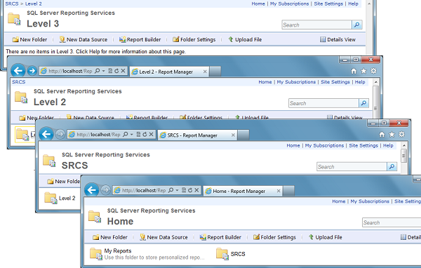
… as you can see here:

… and that’s about as good a way of doing it as I can think of, without rewriting the Report Manager UI.**
Caveats and further comments:
- The negative margin value I’ve added is obviously the key trick. I then added the width value to stretch the table a little bit, so as not to have white space on the right side of the breadcrumb table. There’s probably a better way to do this but I will leave that as an exercise for those of you who actually understand CSS much better than I do. Which is probably most people <g>.
- The actual margin and width values that work in your environment will vary according to the font characteristics in your ReportingServices.css for this class. So you can’t just plop in my mods, you have to play with it for a while, as I did.
OTOH, once I did find the right margin value for my CSS, it did look reasonably good in different browsers and window sizes, and even at different zoom levels. - As you can see above, you can still get to the “Home” (root) of your folders, either typing an explicit URL into your address bar or using the “Home” link on the right side of the same row of the breadcrumb table. Octoni didn’t ask for a way of removing that right-side link, and I’m not sure it’s germane to his/her requirements.
Maybe s/he just wants to make the breadcrumb trail neater since the “Home” breadcome is kind of redundant. Or maybe the folder names are long and s/he doesn’t want to waste the space. - “Reasonably good” doesn’t mean that this change erases any of the other deficiencies of Report Manager CSS in many modern browsers. **
**But then, some of us think that you shouldn’t expose Report Manager to your users anyway. 😉
Good luck ! Let me know how it goes…