Last time I wrote about an easy way to document SSRS reports, and suggested that we should try to use Report Descriptions in a disciplined manner, so that people choosing to browse RDLs (or other items) in the default Report Manager interface had a chance in heck of figuring out what each item represented.
Here’s something you can’t do …
— Wash
What I neglected to mention, because I hadn’t noticed it, was that Report Descriptions don’t show up in standard view (versus “Details View”) in the SSRS 2008 Report Manager.
I didn’t notice it because I would never personally advocate using the SSRS Report Manager UI as users’ standard interface into Reporting Services.
Report Manager is a nice, simple way for administrators (who are perfectly happy to work in Details view) to upload, browse, and otherwise, um, manage reports, datasources, and related uploaded file resources. It’s not suitable for end-users, and doesn’t match the overall experience you’re trying to give end-users. It’s just plain jarring.
IMHO, the best possible reason for the SSRS SOAP APIs is that they give you all the tools you need to build your own alternative RDL browse, suitable for embedding into your custom application interface. Sure, I’ll use them for programmatic invocation of RDLs occasionally, but I really prefer the URL Access API for that.
For those of you who do insist on exposing Report Manager to end users, I’m happy to report that this is one of many things that the SSRS 2008 R2 Report Manager fixes, or at least improves.
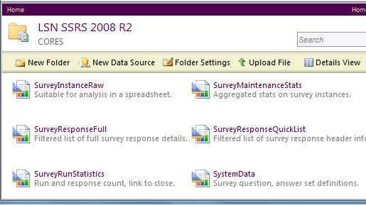
The screen shot below shows the R2 Report Manager UI in what’s now called “Tiles View” (aka the old default/standard view, which some of our users insisted on calling the “Hide Details View”, since there really wasn’t anything else to call it).
Note that the Descriptions have to be pretty short, to avoid getting truncated with an ellipsis. But the restriction concentrates the mind wonderfully on creating the pithy and focussed type of description that will really help your users anyway.

M: You think she’ll hold together?
Z: She’s torn plenty, but she’ll fly true.
M: Could be bumpy …
Z: Always is.
— Capn Malcolm & Zoë
The example image above, a set of old examples on my personal box, is lightly branded using a technique for branding RS 2008 R2 that I’ve shown you elsewhere. I’m experimenting at home with a proper “look” for a coming migration of SRCS’s 400+ user-accessible reports to an R2 instance.
At the same time, rest assured, I’m also working on custom application embedding of new reports. But when you start with a catalog as deep as this one, you have to pick your battles.
Most of our RDLs aren’t very complex, but a few are. And some of them were written for SSRS 2000 originally, I suspect.
It will be interesting to see how our report development techniques survive the upgrade. I’ll keep you posted.
You speak to not recommending the use of the report manager as an end-user interface, but could you enumerate those reasons?
Thanks!
Doug — sure, I guess I could talk about this some more. I’ll try to write a blog post about this later in the weekend. I will try not to rant ;-). Thanks for checking in.